
Notification Centre
Mobile Design
UX/UI Design
Information Architecture
Prototyping
A11Y
User Testing
I designed a scalable web Notification Centre for TUI that centralised customer communications and aligned the web experience with existing app patterns. The solution was delivered as a user-tested MVP using the TUI design system, with accessibility built in through detailed annotations to support inclusive implementation.

Role
Lead UX Designer
Team
1 UX/UI Designer
3 Developers
1 Project Manager
1 Business Analyst
Tools
Figma
Axure
Userlytics (User Testing)
Miro
Overview
This case study showcases the design and delivery of a web-based Notification Centre within the TUI customer account, creating a consistent, scalable experience across platforms.
About TUI
TUI is a global travel company serving millions of customers across web and app platforms, supporting complex journeys from booking through to travel and post-trip communications.
Problem
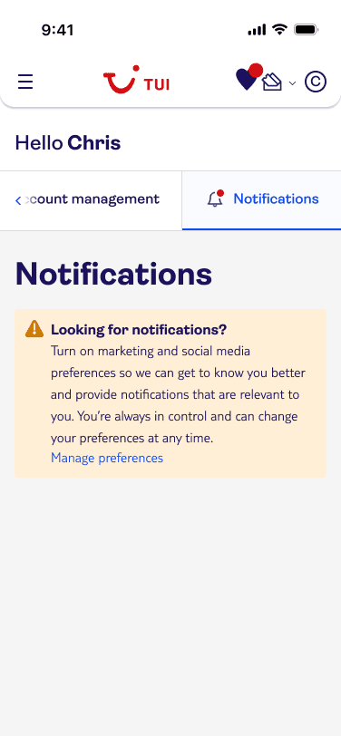
The TUI app included a Notification Centre, but the web platform did not.
As a result:
Important updates sent via app, email, or SMS had no persistent home on web
Customers lacked a single source of truth for trip-related information
The cross-platform experience felt fragmented and inconsistent
Solution
Design and deliver a scalable Notification Centre embedded within the customer account that:
Centralises key customer communications
Aligns with existing app patterns where appropriate
Can evolve over time as more notification types are introduced
Deliverables & Impact
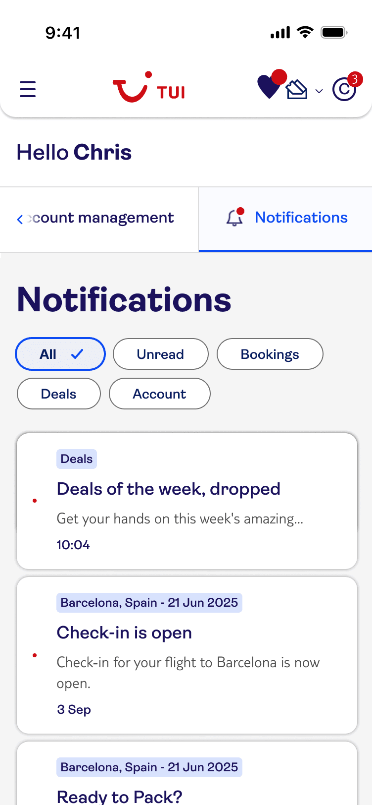
Defined a clear information architecture for web notifications
Designed and validated a user-tested MVP
Delivered a solution ready for phased expansion
Established foundations for future booking-led notification experiences
Discovery
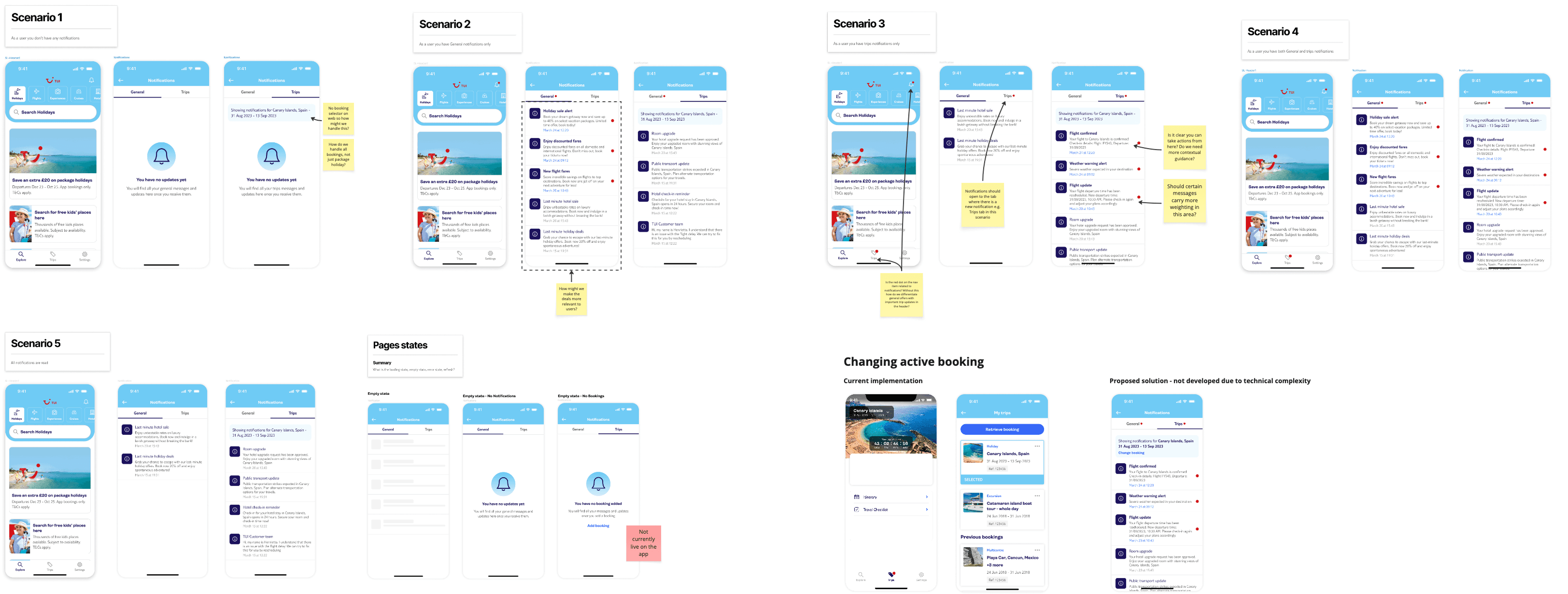
Based on existing flows, stakeholder knowledge, competitive analysis and user testing insights, I was able to analyse what worked well on the app and what improvements/considerations were needed for a web adaptation.
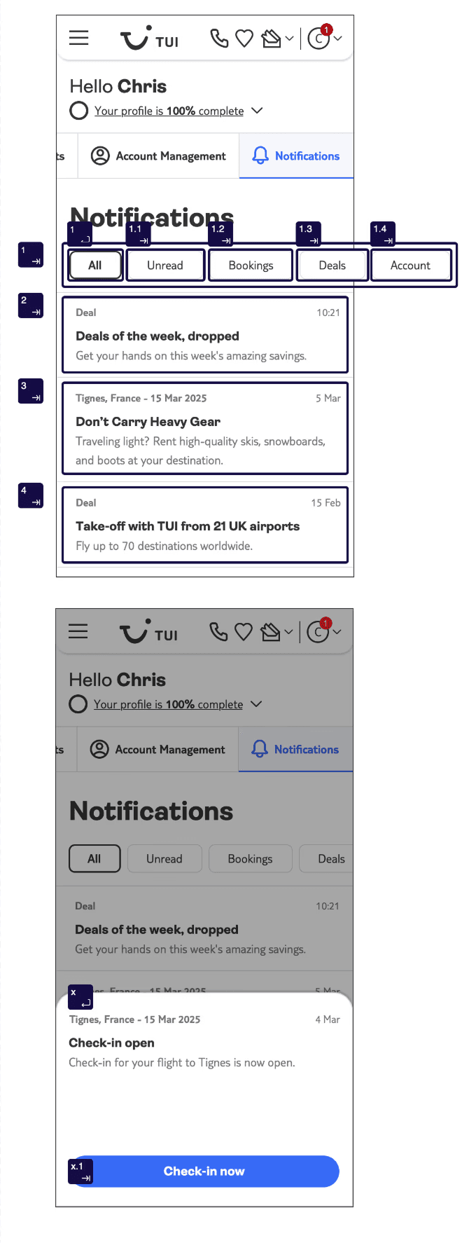
Walkthrough of Existing Solution
Insights from app research showed that:
Users prefer to have booking-related notifications separate from deals and promos
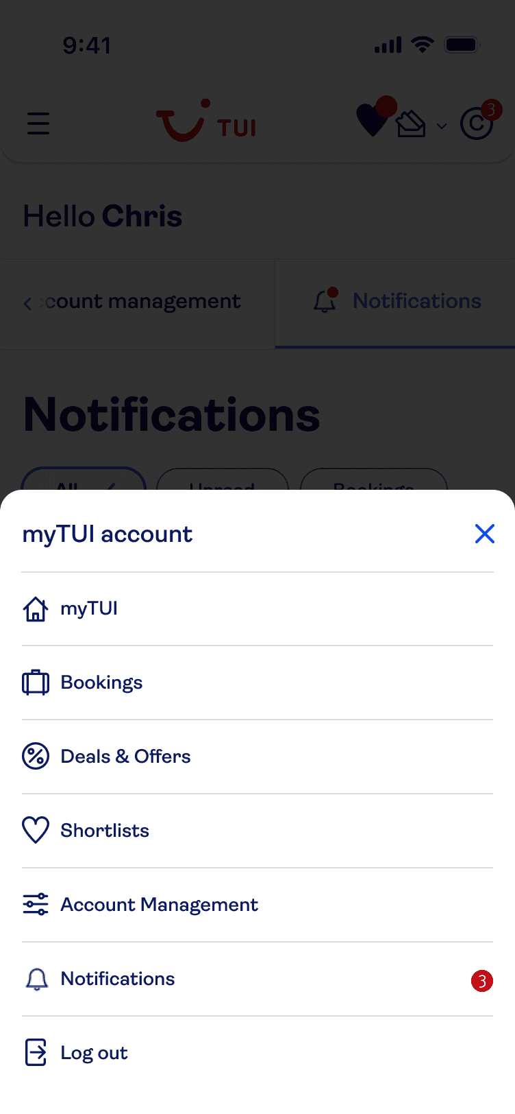
Users expect to access notifications from the top of the screen but the presence of too many icons in the header can be overwhelming
Users appreciate a clear and subtle design that indicated importance without being intrusive
I then outlined some of the challenges we needed to address as we create a solution for web:
The website header is much more cluttered than the app
How can we make the filtering of notifications scalable?
How can users filter notifications across more than one booking?
How will we integrate notifications with 'Manage my Booking'?
User Flows
I mapped key journeys and edge cases to ensure the experience was robust, not just visually polished.
General flow for viewing and interacting with notifications
Handling notifications for multiple bookings
When users have no notifications or require cookie consent
Managing notification preferences*
Receiving urgent notifications while browsing the website*
*Later removed from scope for MVP due to timeline constraints and various technical considerations.
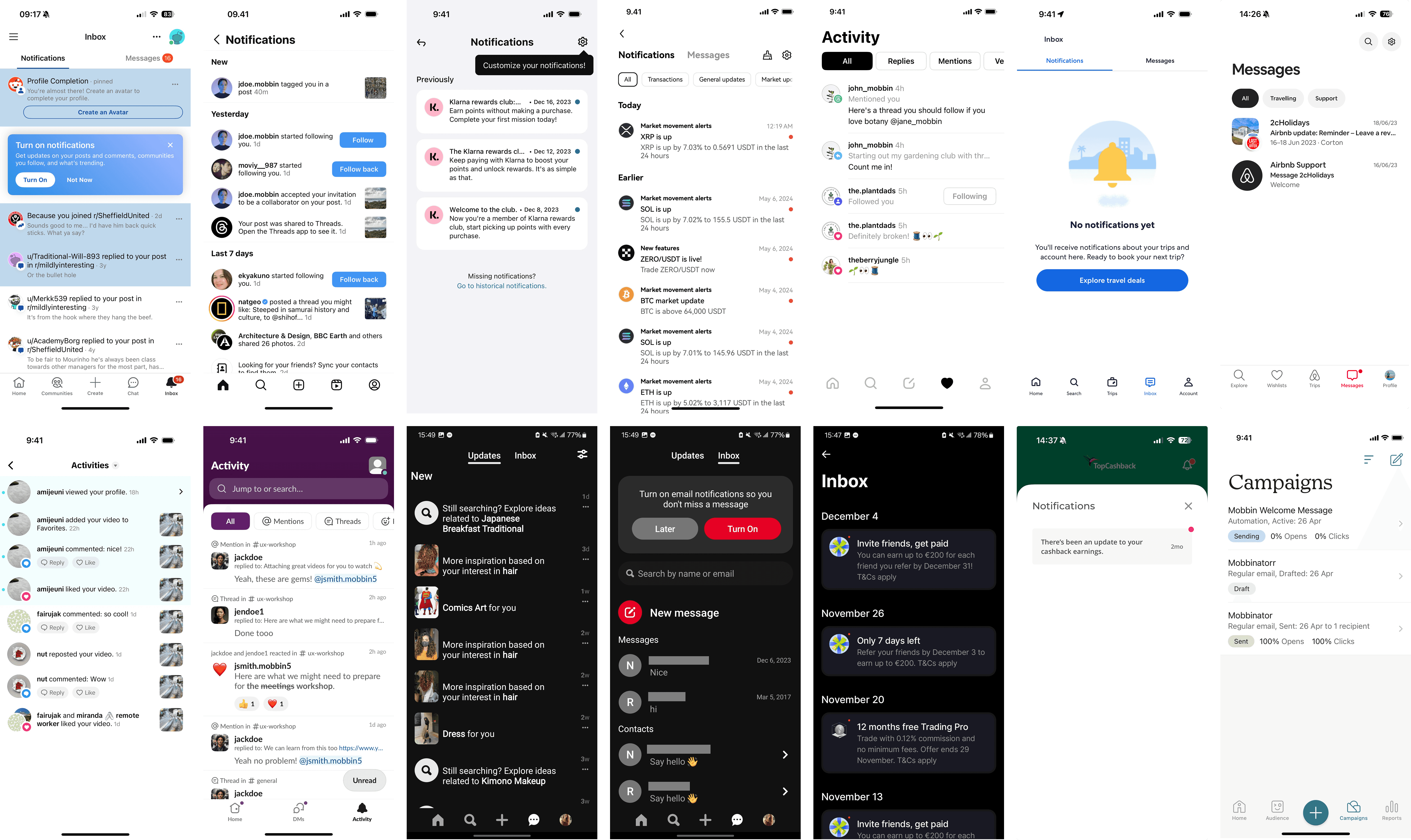
Competitive Analysis
I reviewed best-in-class notification patterns across digital products to:
Validate common UI patterns (filters, unread states, CTAs)
Avoid reinventing established conventions
Inform scalable design decisions
Ideation
Building on the insights from discovery, I facilitated an online ideation workshop with various stakeholders from across the business that would be impacted by a notification centre on web. This included members from design, product, content and engineering.
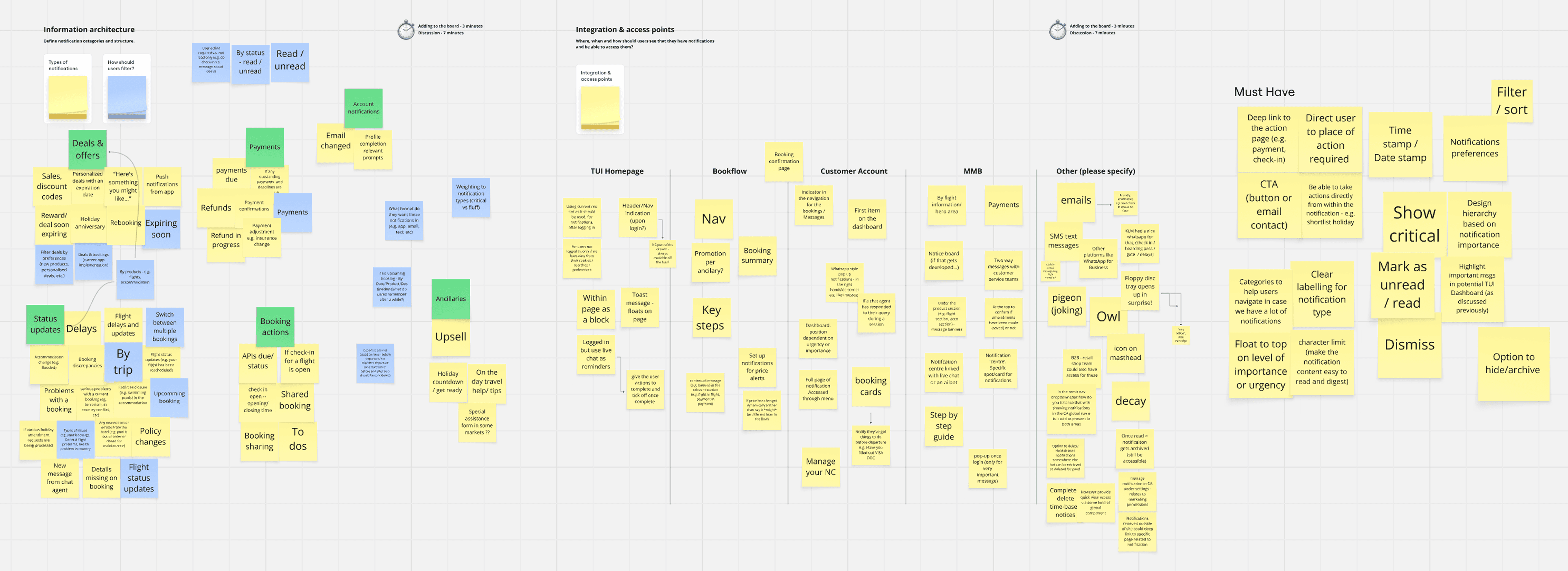
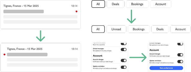
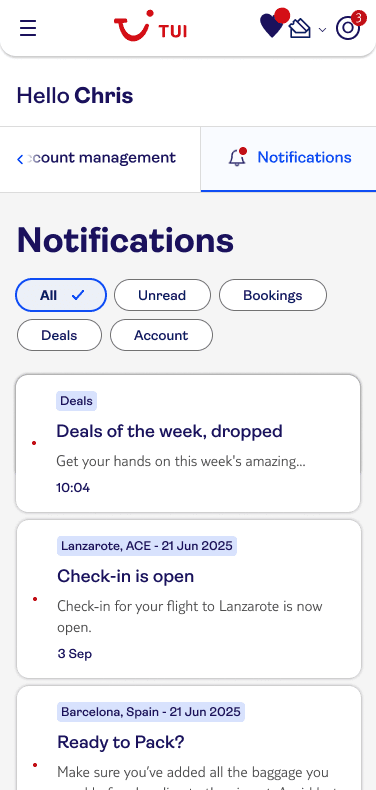
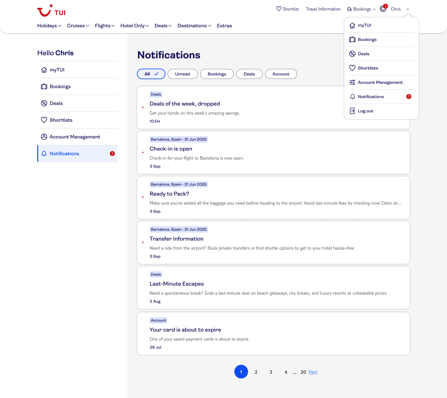
Information Architecture
The Notification Centre was structured to:
Group notifications logically
Support filtering via chips
Provide clear access to notification settings
Scale as new notification types are added
Feature Prioritisation
MVP Focus:
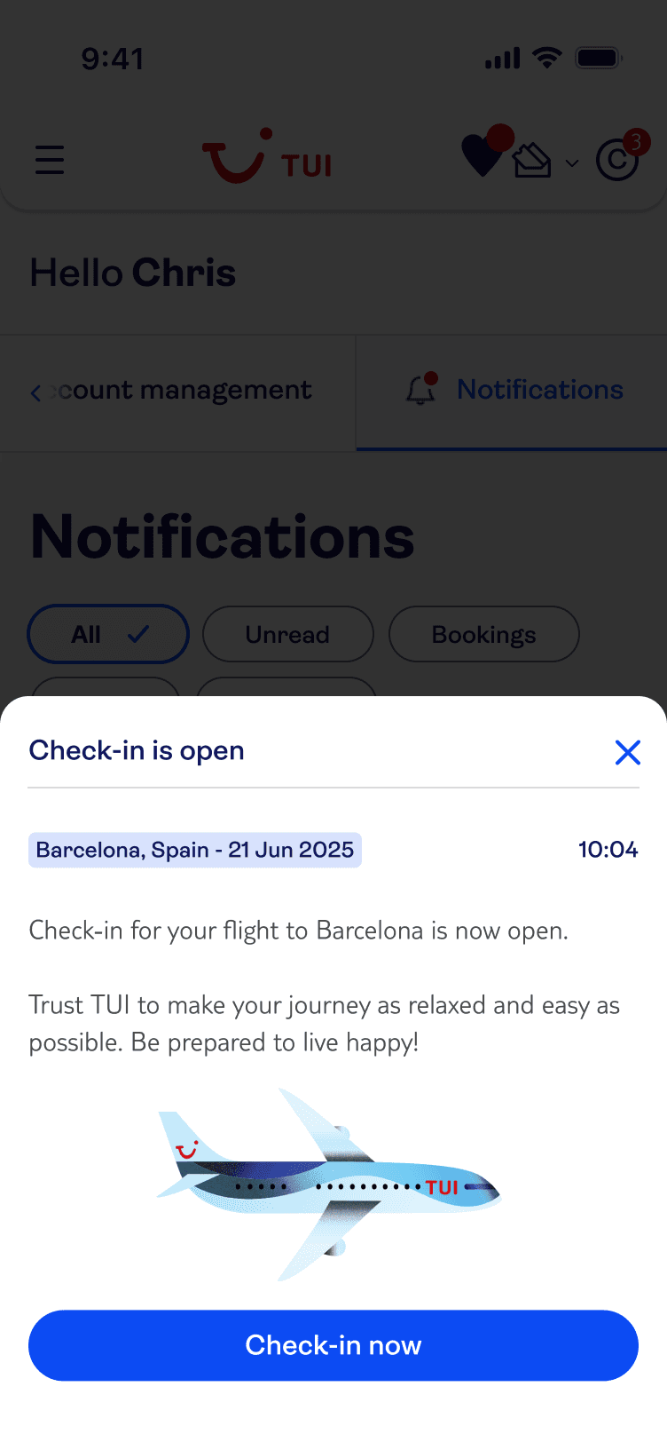
Booking-related notifications
Basic filtering
Clear unread states
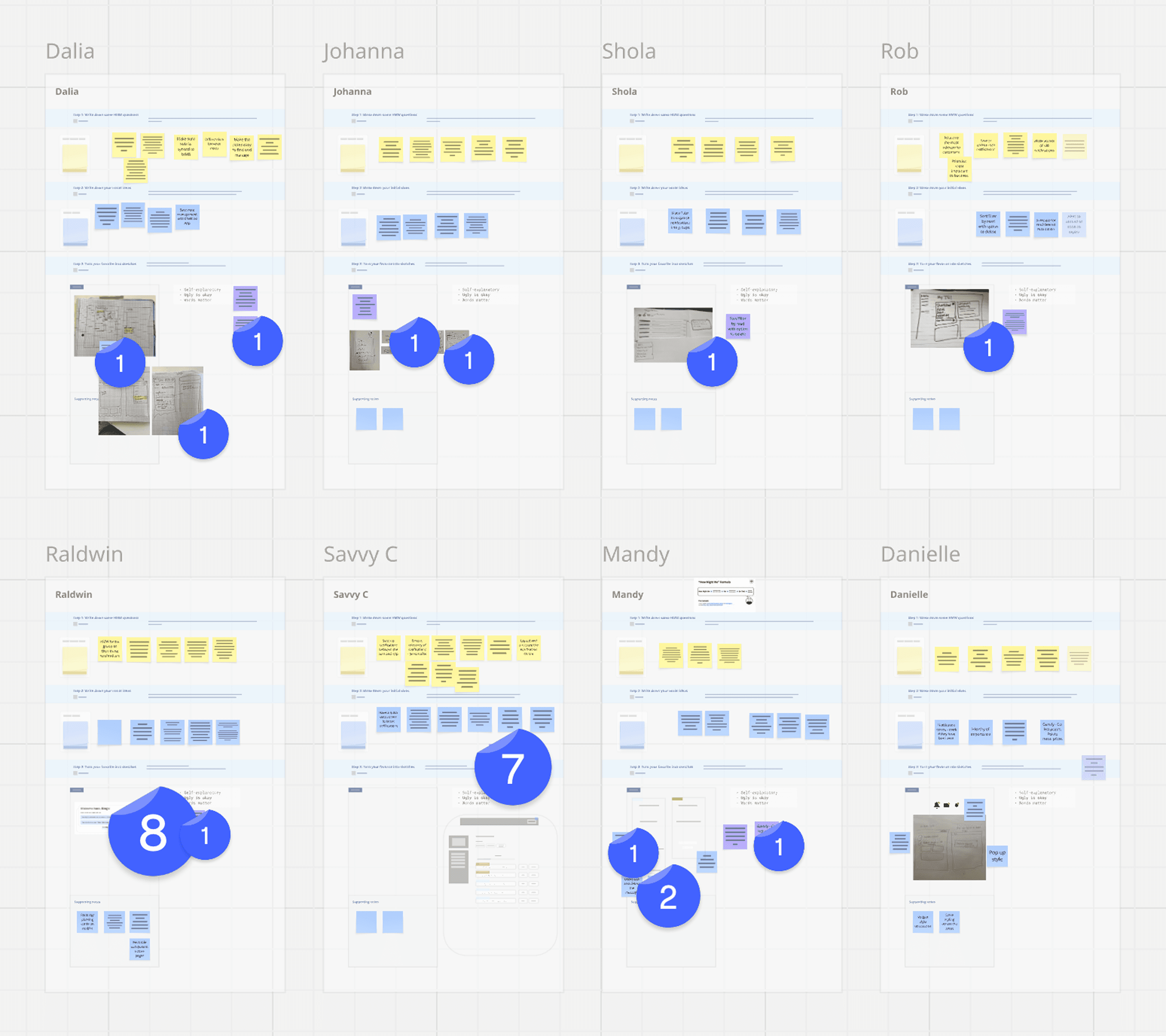
'How Might We' Statements & Sketching
Using the IA and feature prioritisation outputs, workshop participants created HMW statements which they then used to guide early sketches and explore layouts.
Design & Testing
From wireframes to prototype
I explored multiple layouts for notification lists and cards
I designed filtering mechanics aligned to user priorities
I built a complex Axure prototype simulating real interactions

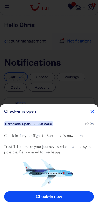
User Testing
Testing showed that:
Booking notifications are the highest priority
Users want control over notification preferences*
Scan-ability is critical when messages accumulate
*The value placed on this by users spawned a separate project focussed on a solution for all communications and user-defined preferences, removing it from the scope here.
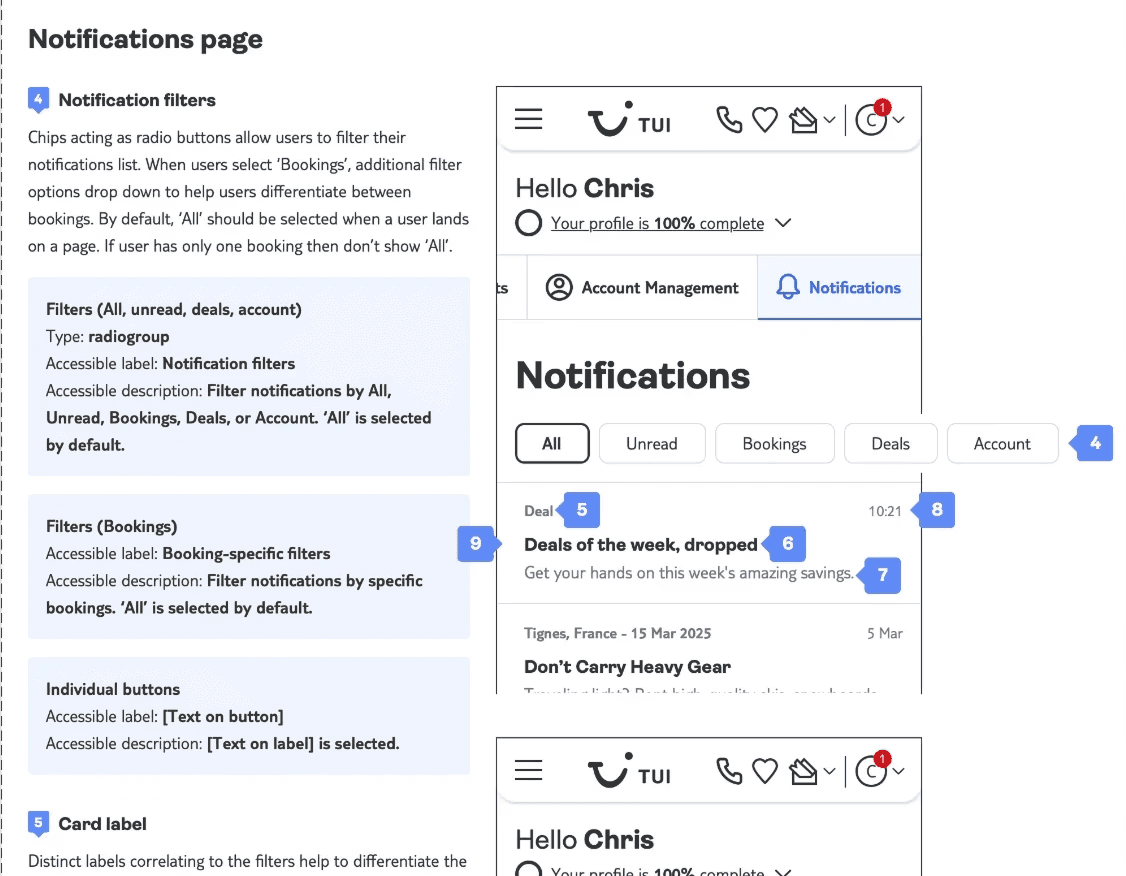
Accessibility & final designs
The final designs were created in Figma using the TUI design system, ensuring visual consistency, scalability, and alignment with existing web patterns.
Alongside the UI designs, I produced accessibility annotations detailing:
Page and component landmarks
Relevant ARIA roles and attributes
Keyboard navigation considerations
Screen reader behaviour and focus order
This ensured the solution was not only visually polished but also accessible by design, supporting inclusive use and providing clear guidance for engineering during implementation.

Reflections
Future Vision
This MVP lays the foundation for a booking-led Notification Centre. As more complex data sources are integrated, the feature can evolve from a convenience into a critical trip-management tool.